Newspaper Makeover
A closer look at our redesign and why we made some changes
The Puma Press has a fresh new look. We have used the same templates since the 2016-2017 school year, so I thought my LaunchPad was the perfect opportunity to redesign our pages. As University Prep’s student news source, we want our look to appeal to our audience by being up-to-date, easy to read, and stylish. Here’s a deep dive into the decisions we made.
Back Page and Cover
The cover is the first thing people see when they pick up our latest issue. We’ve moved the rhymes that tease three articles to the top of the page. There are no longer rectangles spanning the top and bottom of the page, so readers can see more of the main photo or graphic that represents the feature story.
On the back page, we’ve implemented a creative new graphic to make the Heard in the Hallways more personable and tell a story with the visuals. Furthermore, instead of running across the page, our comic will be a square to make the Rants and Raves easier to read.
Typography
In the redesign, we focused on readability and aesthetics while changing all of our fonts. For body text, we’ve switched from Swift LT Pro to PT Sans Pro, and for headlines and supplemental fonts, we now use Acumin Pro instead of Din Pro. Our hope is that sans-serif fonts will be more comfortable for readers since they are simple and more modern.
Additionally, we’ve expanded the width of our text columns and made the font size for headlines smaller. While we recognize this is non-traditional for newspapers, this makes stories easier to read and leaves more space for visual elements that draw readers into a story.
Visual Elements
‘Pull quotes’ are exceptionally interesting quotes from an article that stand out on a page. We’ve updated the look of our pull quotes so they are more attention-grabbing. Ideally, they will make readers like you more interested in reading the rest of the story.
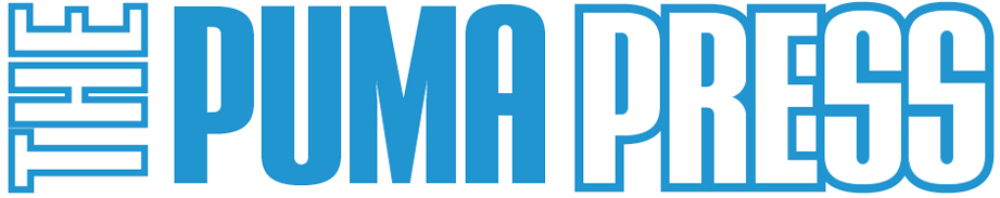
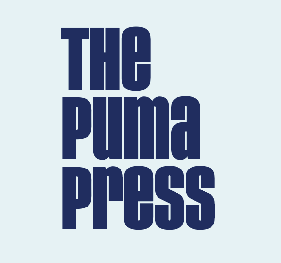
The other main visual upgrade we made is to our logo. We’ve kept the classic Puma Press font but now the text is stacked so it can fit in a square on the corner of the cover page. This frees up space and is more of a logo instead of just a line of text.
We hope you enjoy the new and improved Puma Press. Please don’t hesitate to give any feedback about the redesign to the Editors-in-Chief, and be sure to further explore the website, which is also recently updated.
Your donation will support the student journalists of UPrep.